Redesign of CaaS web app
To stand out amongst its competitors, a visual overhaul of Caas platform was done through streamlining UX of plethora of user actions
Timeline
May 2017 - Jan 2018
Company

Sloppy.io
Team
cross-functional team of 6
Sloppy.io is a managed CaaS (container as a service) platform that provides cloud infrastructure and workflow tools to run fast and cost-efficient micro-services and container applications.
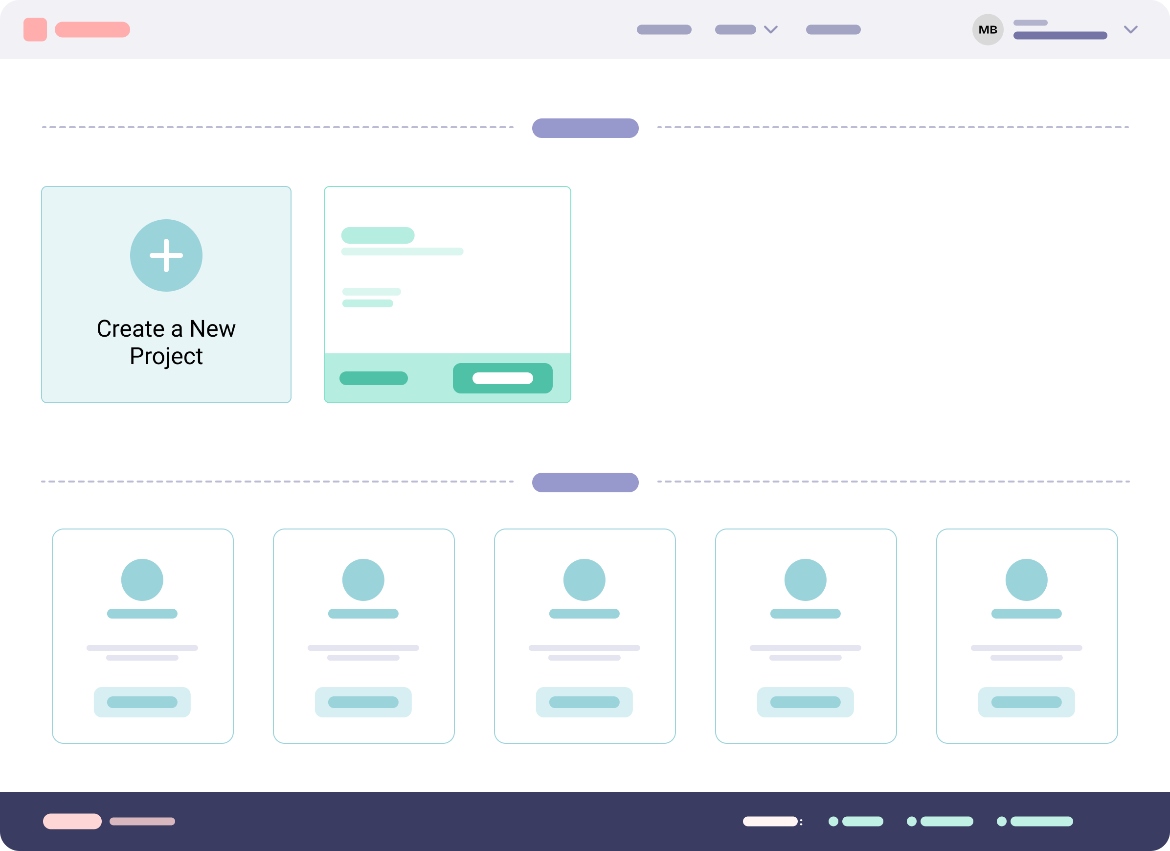
Dashboard | sloppy.io's redesigned web app
The Existing Web App
The key features of the sloppy.io’s existing web app include:
- Dashboard view showing a user’s projects & 1-click templates for quick deployments
- Create project wizard view allowing creating a new project with multiple services & apps
- Existing project view allowing to edit the project, analyze statistics, and view logs.
- Account view where the user could update their profile & manage subscription
Old Designs of the Sloppy.io's Web App
My Role
I was the Lead UX/UI Designer in a cross-functional team of 6, including a Senior Front-End Developer, CTO, CEO, Marketing Manager & Customer Support Agent.
My tasks
- Gather & evaluate user requirements in collaboration with stakeholders
- Collect user feedback, making a list of problems in the existing user journey
- Illustrate design ideas using hand sketches as solutions, followed by wireframes & prototypes
- Design custom icons & illustrations
- Achieve visual consistency via harmonious UI elements & style guides
Challenges & Constraints
- Being a designer, understand the existing product from the point of view of an expert developer
- Introduce visual hierarchy on the dashboard, which contains a plethora of user actions
- Reduce visual clutter while managing expectations of existing shareholders
- Make educated assumptions due to lack of user research & analytics
- Time to improve the web app was limited as it had to be presented in front of the investors soon.
Problem Statement
Sloppy.io’s web app’s design looked outdated compared to its competitors, like Digital Ocean. A visual overhaul was long overdue. Therefore, we set out to reimagine the UI & UX to stand out amongst its competitors.
Business Goals
The primary goals were subscriber retention & increment in conversion rate.
- Retain existing customers by solving problems they face with the app.
- Provide good UX & make the design aesthetically pleasing to impress & convert trial users into subscribers.
Improve the usability of the existing web app focusing on aesthetics.
User Pain Points
Sloppy.io’s product targets the web development community & focuses on easy deployment of docker containers.
A typical user should create a project using a docker image, deploy it to a secure server, perform maintenance and monitor it continuously.
Due to a lack of existing User Research, I had to put myself in the user’s shoes testing the web app. I came up with the following pain points:
- Missing helper tooltips & basic information when creating a project
- Missing feedback for actions
- Missing form validations
- Cluttered UI, confusing at some places in the user journey
Existing design for "Create a Project" screen vs Improved Design
Rationale for redesign
As the app was old-fashioned and had lost its attractiveness, existing users were facing problems using it. The conversion had decreased, and the company was losing money.
To compete with brands like Digital Ocean, we felt a strong need to revamp the look & feel of the product.
After some discussions within the team, we decided on redesigning the existing web app. The key motivations for the same were:
- Improve the overall user experience by making sure users can complete their tasks without friction.
- Follow the latest design trends providing a modern & familiar experience to the users.
Ideation
User Flows
I started making user flows depicting how users could complete various tasks within the app. It helped me visualize the interfaces & define the priorities of screens to be built.
User Flows
Sketches — Pen & Paper
I sketched some low-fidelity pen & paper wireframes sharing feasible solutions for required screens. One of the crucial screens was the user dashboard.
Variations of User Dashboard:
User Dashboard Sketches
Wireframes — Balsamiq App
I converted the finalized Dashboard Sketch into Wireframe among several other relevant screens, which required improvements. Also made high-fidelity wireframes only for complicated screens and new features.
Finalised User Dashboard Wireframe
Final wireframes of Account pages & new features like “Volumes”
I shared the progress with the rest of the team as prototypes using InvisonApp, establishing a quick feedback-iteration cycle.
Designs — Sketch App
UI style guide
While converting wireframes to designs, I created a UI style guide.
I used a sans-serif font to keep typography readable & functional.
Sloppy.io didn’t have any pre-existing color palette. Their original brand color was blue. Using matching monochromatic colors, I selected a muted color palette to give the brand a subtle & calm look.
I created commonly used UI components, making sure all the elements are cohesive & consistent. Leverage the design system to build new features.
I created a clear differentiation between action & default buttons. I also designed different button states, removing confusion for the users.
Visual Designs
I put together components from the UI style guide to create screens keeping in mind:
- Focus on clarity
- Aesthetically appealing
- Easy to understand & use
- Feedback elements like tooltips, confirm dialogs, alerts, etc.
Creating a New Project on sloppy.io’s web app:
Create a New Project
Visual Design of the web app
Testing
Testing amongst the team
I created prototypes of the completed designs. The prototypes were tested amongst the team members for feedback. Our target users were developers. I analyzed the prototypes within our team of developers to empathize with the user & provide actionable insights.
I shared my designs with the development team through Zeplin for the smooth transfer of assets. I closely worked with the Front-End-Developer for the implementation of designs to code for pixel-perfection. It turned out beautifully.
I constantly made minor improvements on the designs through the feedback provided by the team members & kept an eye out for service requests from our customers.
Deploy a new project using “click-starter” feature:
Deploy a new project using “clickstarter” feature
New Features Added
To make the web app even more functional for our users, I created some new features along with the team. These features were added to help the users to enhance their usability & expectations from the app.
A feedback-based improvement cycle was established & simultaneously, new features were added based on the actionable insights:
- Billing Screens with substantial improvement in Subscriptions
- New Team feature for users to share project access with other users
- Changed quick-starters (create a draft with pre-filled information) to click-starters (deploy predefined projects with one click) so that the deployment success ratio is higher
Billing & Subscriptions features:
Billing & Subscriptions GIF
Subscription & Updated Billing Screens
Update address & payment methods in Billing Screens
Team Overview Screens
Final Words
Results
There was a reduction in customer support tickets regarding the user experience complaints, which proved to be a significant improvement. The users were able to complete their tasks faster & with way fewer complications.
Key Learnings
Refined my skill set in the UX Redesign process while working on several multi-disciplinary projects. Also discovered my interest in Marketing design and Illustration work.
Things I could have done differently
I realised that I could have done a much better task of improving the web app if I knew user research techniques. Maybe I could have asked the stakeholders to follow some kinds of qualitative or quantitative user research methods to properly validate the designs or at least use tools like hotjar to track data on the app.
There was no prior setup of data/analytics collection of the web-app performance. Customer support tickets were beneficial. I was able to know about their difficulties in their tasks on the app.
While making design decisions, I always discussed my queries with my Team Lead, who was well aware of the user complaints & pain points. Due to budget & time constraints, I had to skip some essential steps in the design process, like conducting user interviews, creating personas, storyboarding, etc.
I would love to follow proper User Research in my following projects & learn more about User Research methods.