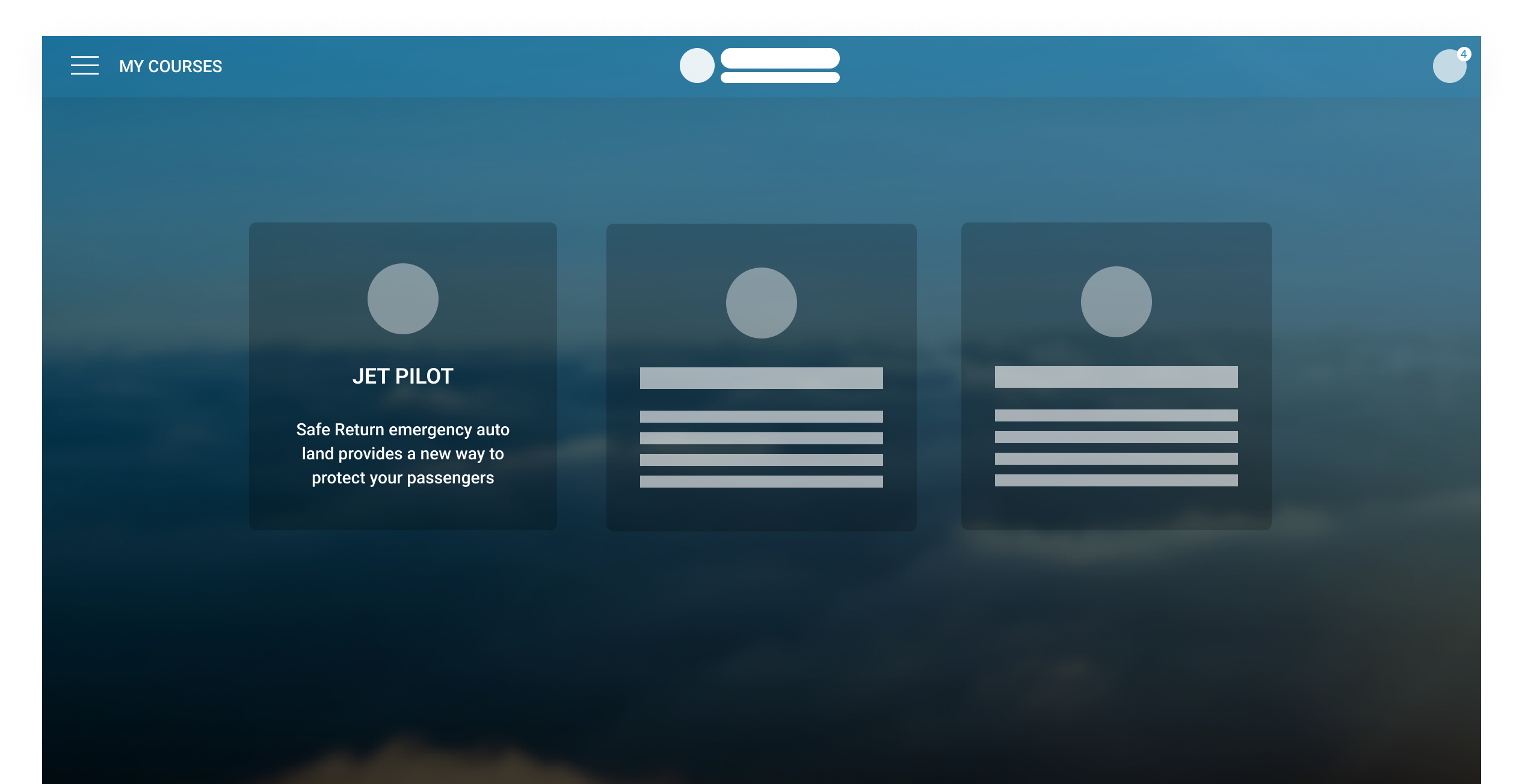
Learning management system (LMS)
Creating a learning management system for customers of vision jet.
Timeline
4-6 months
Company

Designori
Team
management and engineering
Introduction
As part of an Alaska-based design agency called Designori, I spearheaded the design process for creating an LMS (Learning Management System) for Cirrus Aircraft's Vision Jet, aimed at enhancing the learning experience for their customers.
Vision Jet represents a new category of aircraft—the Personal Jet—within Cirrus Aircrafts fleet, offering luxurious and user-friendly flying experiences.
VISION JET - THE NEXT EVOLUTION IS HERE
User Base
The target audience consists primarily of middle-aged to elderly Americans purchasing aircraft for personal travel purposes, typically possessing disposable income to invest in luxury jets. This demographic includes individuals leading busy lifestyles.
User Needs
- The primary user needs revolve around providing an accessible platform for learning to operate the Vision Jet aircraft efficiently.
- This includes access to a variety of learning resources such as instructional videos and courses tailored for both novice and experienced pilots, as well as for instructors.
Why we created a Learning Management System?
Previously, prospective buyers relied solely on brochures to familiarize themselves with the features of Vision Jets, which only provided limited information. Learning to fly the planes was a challenge, they had learning material and of-coarse classes to attend.
Cirrus Aircraft identified the necessity for a more comprehensive and time-saving solution to educate their customers about the jets.
Problem Statement
While customers had the option of in-person training, this approach was often time-consuming and less flexible. Therefore, there was a pressing need to provide an accessible platform for learning about all aspects of the plane, offering convenience and saving valuable time for the customers.
Design Process
After understanding our Client's Cirrus Aircrafts requirements and users, we started defining the basic user flow for our LMS.
User Flows
We had two user base:
- Cirrus Aircrafts's Customers purchasing Vision Jets
- Cirrus Aircraft's Employees/ instructors creating courses on the LMS platforms for the buyers
Customer User Flow
Admin User Flow
User Persona
After conducting 5-7 discovery interviews, we had a basic customer persona for us to refer to when building our LMS features. We kept in mind the below persona to build our main customer facing features and made modifications for our Admin facing app in the same theme.
Customer persona
Sketches & Wireframes
Once finalised within our team, I converted the user flow to sketches for us to visualise how we could arrange different elements.
Sketches for admin and user dashboards
For more descriptive screens, for e.g. course progress screens, I created wireframes.
Versions of course tree along with the progress
Backgrounds and Color theme
After examining Cirrus Aircraft's main website, we opted to experiment with various color themes. Our primary focus was on infusing elegance into the design, complemented by subtle sky tones, taking into account our user base.
Choosing our background for LMS
Similarly, we conducted experiments with the Login/Sign-up page to ascertain our client's preferences regarding the background.
Login/Sign-Up Screens
UI design theme
Following feedback from our client's team, we decided on a background featuring sky clouds. Subsequently, I commenced the creation of UI design elements:
- Selecting fonts & determining typography sizes
- We chose Droid Sans font to give a crisp and elegant feel along with blue cloud background
- Finalising color codes: cirrus blue and yellow as the accent color to keep it professional considering our middle to older age user base
- And essential UI elements like buttons, navigation, progress bar etc
UI elements finalised for Cirrus LMS dashboard
Login and Sign-up screens
Designs for our LMS dashboard
Putting the elements together, we created designs for both user base keeping the customer facing flow as our focus.
Main screens in our flow:
Courses Dashboard
List of all the courses in a boxed format with CTAs.
Courses on customer facing dashboard
Course Tree
Showcasing all the modules and lessons inside each module along with the user progress in a tree format.
Course Tree on customer facing dashboard
Lesson Screen
Screen with an overview of lesson details, along with the estimated time of completion. With appropriate CTAs.
Lessons screens on customer facing dashboard
Element Screen
All the elements that the user can take inside a lesson, along with the lesson user progress. It includes chapters with text, videos etc
Element screens for customer facing dashboard
Quiz Screen
One of the screens with quizzes which makes the user reach towards a better learning experience with confidence.